


Talon.One
The World's Most Powerful Loyalty & Promotion Software | 300+ global clients | 3X offer on ROI | €100M+ campaign per day
Year:
2022
Category:
Marketing SaaS
Role:
UX Consultant

About
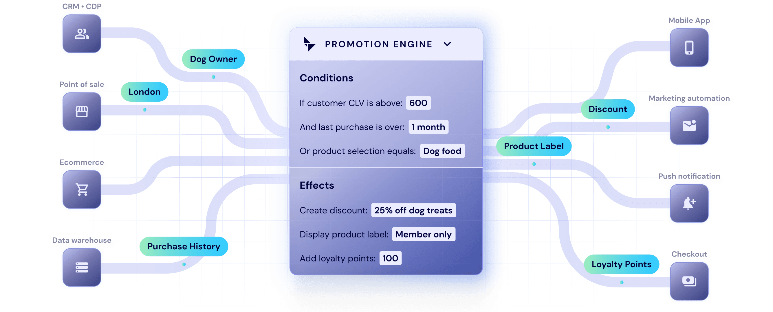
Talon.One is the most powerful incentives engine that unifies loyalty, promotions and gamification into one holistic platform.
The Brief
We are looking to improve our product from a UI/UX perspective and require review of the elements of the campaign manager (Ca-ma) feature. Please highlight current design weaknesses with some easy-to-implement solutions we can act quickly on. We would also like a North star design that follows our brand product guidelines.
My Approach
For this project, audit-to-design, I first conducted a structured walkthrough to understand the information architecture, key user journeys, and UI patterns across modules. From there, I prioritised the areas with the highest impact and most visible friction–primarily the Campaign dashboard and Campaigns overview, where clarity, scan-ability, and decision-making speed are critical. The Loyalty and Budget areas presented fewer UX issues, but revealed notable UI inconsistencies (alignment, spacing, visual hierarchy, and styling) that undermine perceived quality and should be standardised across the product.
Based on the audit findings, I translated recommendations into high-fidelity redesign concepts – demonstrating how improved layout, visual hierarchy, UI patterns, and component usage could strengthen usability, reduce cognitive load, and create a more cohesive interface, bringing forward the Talon.One brand.


UX Audit
Campaigns Overview
Filtering is too limited (single filter only); complex dashboards benefit from multi-filter, granular filtering.
Campaign name column should be resizable to handle varying lengths and free up space for other data.
No sorting/reordering options; users should be able to customise the list view based on their needs.


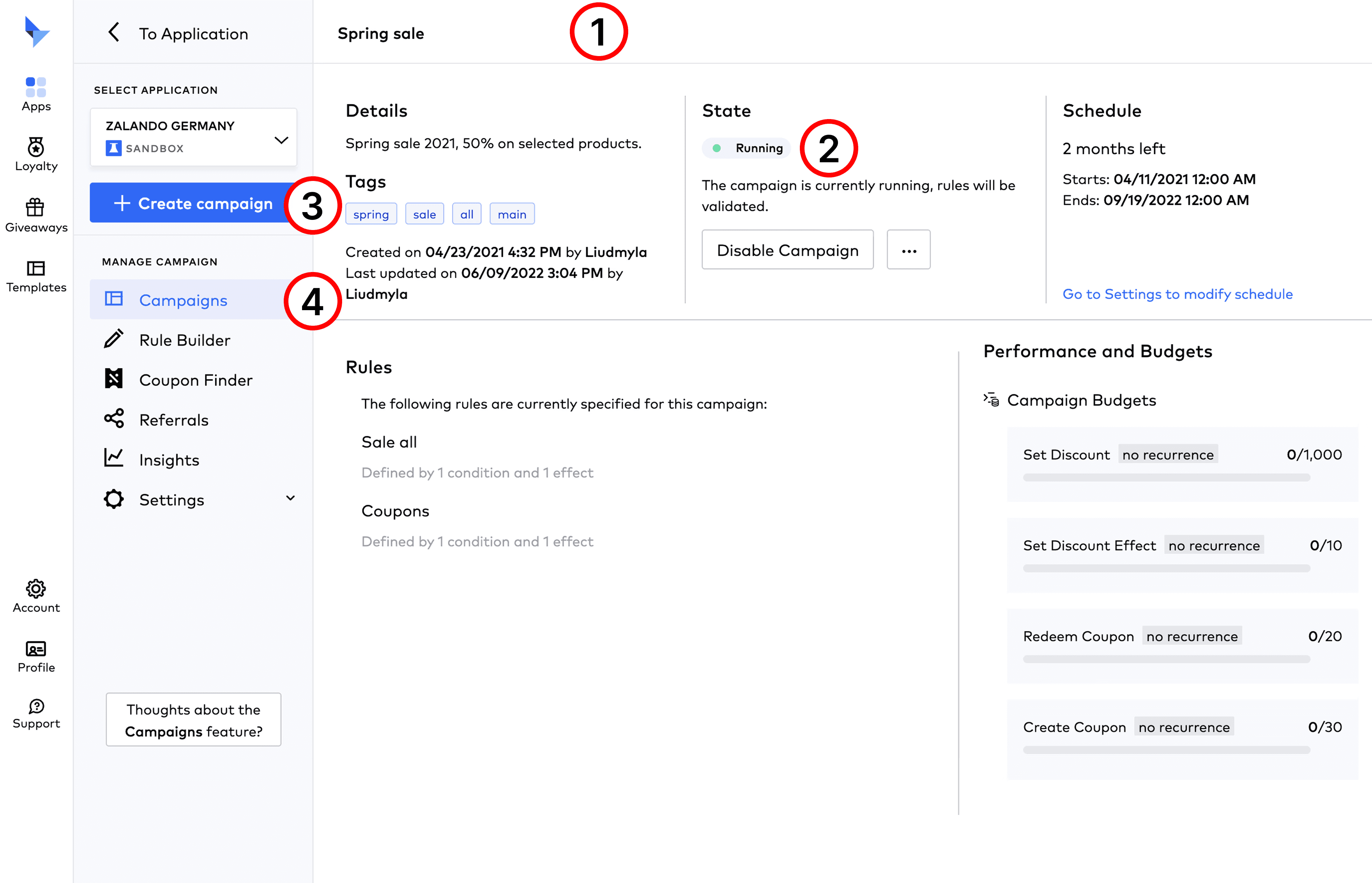
Campaign Dashboard
Visual hierarchy is inconsistent, making key info hard to scan (e.g., the campaign name is smaller than the “Details” section header).
Spacing in the “Running” status chip is uneven (left/right padding and dot-to-text spacing don’t match), which hurts overall UI polish.
“Create new campaign” on a campaign dashboard feels unnecessary—users are likely there to monitor and configure the current campaign.
Icons are duplicated (Template, Dashboard, Campaigns use the same one), reducing differentiation and discoverability.
Lack of consistency with the capitalisation in the menu labels (e.g., dropdown items): some use Title Case, while others use sentence case or all lowercase. This should be standardised across all menu sections for clarity and visual consistency, here and anywhere else.

Loyalty Programs
This section looks generic. A light UI refresh could make it feel more Talon.One while keeping it functional—and it should be quick to ship.


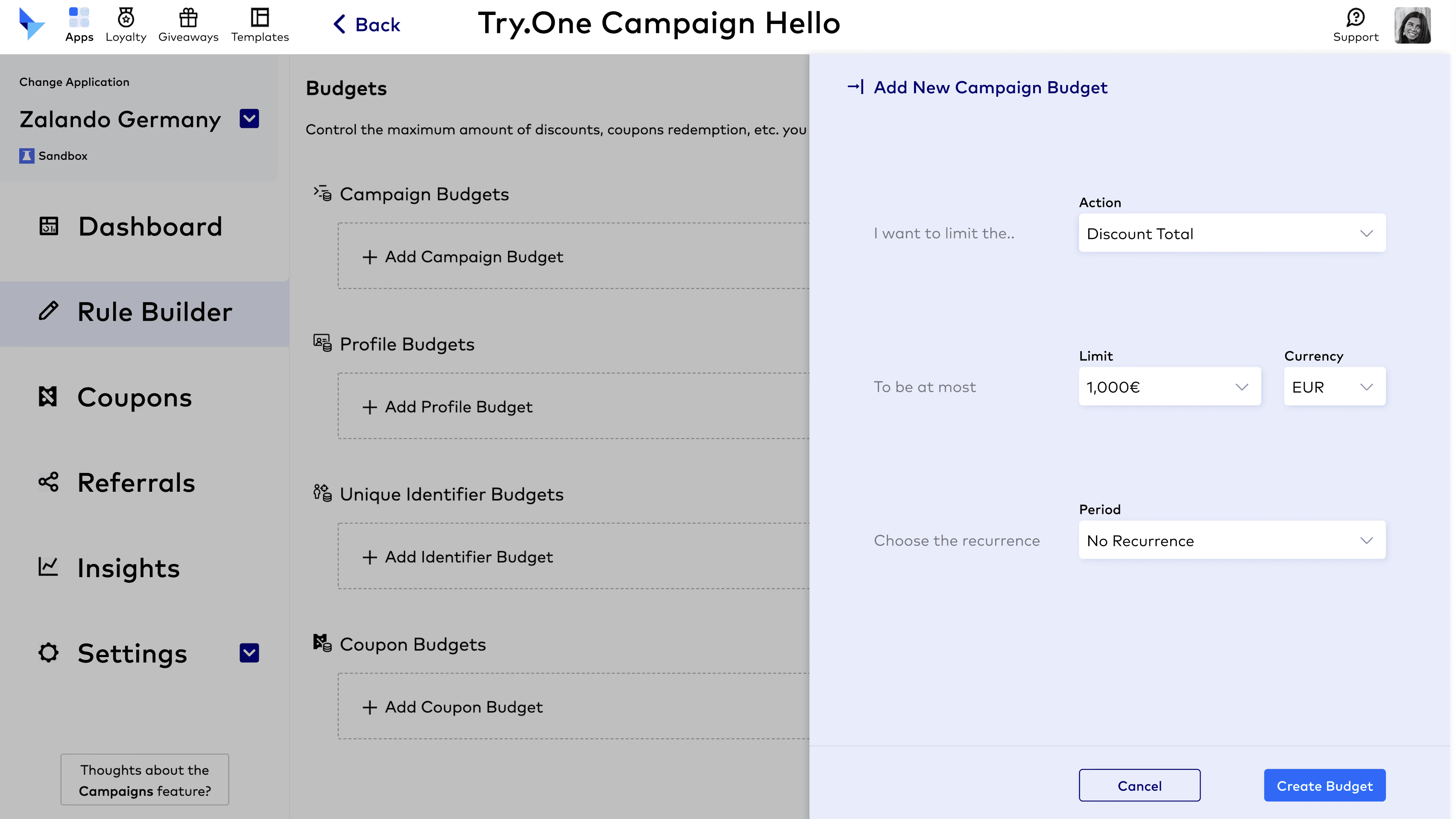
Campaign Budget
Alignment/layout inconsistencies even on this simple screen reduce polish and clarity.
Weak grouping: related controls are too spread out, making relationships (e.g., “I want to limit…” → “Action”) harder to parse.
Currency control/visibility missing: users need an easy way to change currency or always see which currency is active.
Inconsistent text casing across menus and labels (Title Case vs Sentence case vs lowercase).

Additional feedback
We could lean more into Talon.One’s brand colours to make the UI feel more distinctive and immersive, while also helping users differentiate sections, features, and components—resulting in a more welcoming experience.
Visual hierarchy also needs a significant upgrade: as a first-time user, the density of text and actions feels overwhelming. Clearer typographic structure (font size, weight, spacing) would improve scanning and navigation, and the current small type risks readability, fatigue, and accessibility issues.


Recommendations

Projects
other


