


MyCity
A modular traffic and mobility command center for smarter cities. | Velocity +25% | User satisfaction +20%
Year:
2022 - 2025
Category:
Traffic Engineering SaaS
Role:
Lead Product Designer
Overview
Raising the bar, boosting consistency, reducing technical debt, untangling complexity
MyCity is positioned as a modular, web-based SaaS platform for traffic engineering and urban traffic management that brings twelve complex modules (e.g., traffic management, monitoring, analytics, strategy management, adaptive control, and more) into one ecosystem. Its modular structure by design is intended to ease scalability across city needs and sizes.
My focus was to make the platform feel like one product by reducing inconsistency and technical debt, lowering cognitive load for traffic engineers (end-users), standardising UI style and patterns across modules, and evolving a well-documented design system teams could adopt while shipping in parallel, craft new features and make pre-existing user-flows more effective.
My role
Lead Product Designer, cross-module platform ownership
I managed a team of four designers and collaborated closely with twelve developers across front-end and back-end. Day-to-day, I worked alongside traffic engineers, PMs & POs, DataOps, and DevOps. Worked directly with city stakeholders (clients, governance and users) when needed for user research and validation (e.g. interviews, surveys, rapid prototyping, task analysis, usability testing, A/B testing). MyCity was developed by multiple "tribes", each responsible for a specific product area. Within that structure, I operated as the design lead across the platform, with deeper daily involvement in four of the most important modules.
My responsibilities ranged from platform-level UX strategy, standardisation and UX maturity boosting, to hands-on feature and components design as well as iterative improvements of existing flows. A significant part of the role was aligning designers and front-end developers for/during the sprints, designing/improving and implementing processes, reducing UI drift and technical debt, refining and progressing on the roadmap objectives and JIRA tickets, owning design sprint reviews and quality-standards achievement, ultimately ensuring the platform stayed consistent as modules evolved.
The challenge
A unified platform promise, but fragmented reality
MyCity’s value proposition is integration: one ecosystem where cities can manage traffic flow, monitoring, strategy and analytics, and other operational functions with confidence. In practice, the product had grown from legacy products through multiple teams and modules with different histories, timelines, and UI conventions. This resulted in a higher workload for operators: switching modules meant switching mental models, searching for the right button, and interpreting the features and the icons.
At the same time, MyCity is used by expert users (traffic engineers and operators) who depend on familiarity and speed. The challenge wasn’t to “redesign everything,” but to improve clarity and efficiency without breaking workflows that people relied on daily.
Quick note on accessibility
Constraints I designed for: high stakes, high density, and semantic complexity
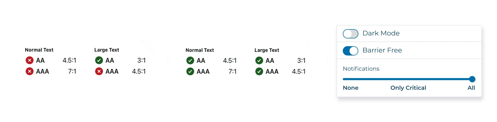
Traffic management software is inherently high-stakes: the interface design must reduce error likelihood, support quick decision-making, and remain readable under pressure. Information density is unavoidable (maps, states, alerts, device health, tables, logs), and semantic colours are not decorative – they’re operational language. That meant layering in pragmatism for the accessibility work: preserving meaning while improving visual hierarchy, legibility, color contrasts, and consistency across modules.
Key design tasks
1) From Platform UX audit to shared actionable roadmap
I began with a structured UX audit to build a common baseline across teams. That included heuristic evaluation, task analysis across key operator workflows, journey mapping and pain-point clustering, and information architecture review. The goal was to convert inconsistency into a shared, prioritised plan.
From there, I worked with product stakeholders to refine priorities against business objectives and delivery constraints, including time-sensitive custom projects for large cities (e.g., readiness milestones tied to major international events). The output was a roadmap that balanced platform consistency, module autonomy, and shipping realities.
2) Standardise patterns to reduce cognitive load
A major lever was defining and rolling out platform-wide UI patterns that repeat across modules, this allowed users to learn once and move faster everywhere. The emphasis was on practical patterns used in real workflows: tables and bulk actions, filtering and saved views, status and alert behaviours, forms and validations, navigation and way-finding, and predictable empty-state behaviour.
This work was about reducing the number of decisions users had to make just to operate the software, and reducing the number of clicks needed to complete common tasks – without forcing experienced operators to relearn everything.
3) Design system evolution that teams could adopt
A design system only creates value if it’s comprehensive enough for real edge cases and simple enough to apply under delivery pressure. I improved the existing system by expanding the component library to cover actual module needs, clarifying usage guidance, and aligning with engineering constraints so components were implementation-ready.
Equally important was adoption. I partnered with engineering and module teams to reduce one-off UI solutions, set expectations for new components and patterns, and create a lightweight governance loop that kept standards evolving with the product rather than becoming an outdated library.

4) Features work and iterative improvements
Alongside platform standardisation, I designed new features and user flows within modules, and improved existing functionality with a steady focus on cognitive load, task efficiency, and hierarchy. The guiding mindset was “evolution, maturity. raise the bar not disruption”: preserve what expert users already trust, and improve what slows them down or increases error risk.


Outcomes
User outcomes: fewer clicks, clearer Hierarchy, Coherent interaction design
Across the platform, the UX became more predictable and modular. Users encountered more consistent interaction patterns across modules, clearer hierarchy that helped the interface guide decisions, and more efficient task flows that reduced unnecessary steps.
Accessibility work improved legibility and reduced ambiguity – particularly around semantic states and the heavy reliance on color meaning typical in traffic systems – while maintaining the operational “language” that operators need.


Delivery and organization outcomes: System thinking, reusable components, faster shipping
Processes refinement and implementation, standardisation and system improvements helped teams ship faster with less rework. Clearer patterns, clearer specs, and shared building blocks reduced repeated design and engineering effort and made parallel development across tribes safer and more predictable. Increasing deadline respect.
Key learnings
It takes a village to make a change, but it can start from one individual. Pitch stakeholders and get them onboard with your vision.
It doesn't matter how wrong something can be, user behavioural habits are powerful and you are designing for them. Don't break familiarity, evolve it towards the goal.
If foundations are shaky, scrap progressing, look down at it, and correct them from the ground up.
Recommendations

Projects
other


